By Brooks Peck

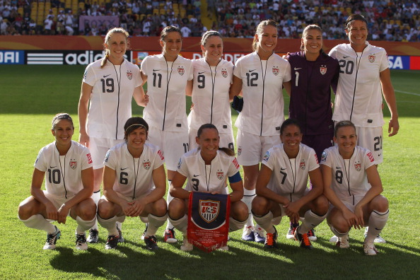
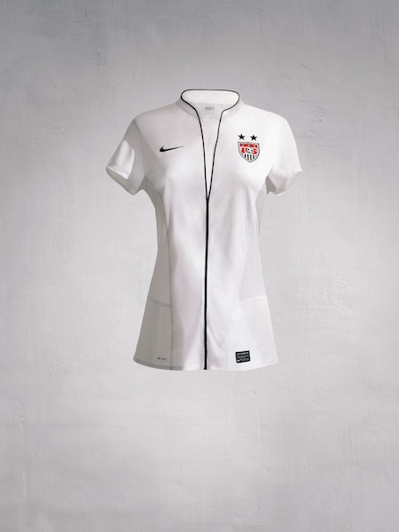
The U.S. began their campaign for their first Women's World Cup title since 1999 on Day 3 of the tournament and they did it in a new kit. The women are once again in their usual all-white home strip. But the new design, worn in their opening-match win against North Korea, already has some fans saying that it looks like a nurse's uniform.
When the new kit was first revealed in April, Dr. Jennifer Doyle of From a Left Wing summed up the problem critics have with it:
A USWNT shirt can always be distinguished from the USMNT shirt by the two stars that the women's shirt prominently displays over the USSF badge - one star for each World Cup trophy they've won (1991, 1999). That difference is not enough for Nike and the USSF. They want you to know, for sure, that this is a not a man's shirt. So the FIFA #1 ranked women's team will go to Germany in a nurse's uniform.This is quite simply the ugliest women's football jersey I have ever seen. It's central problem is the line someone has drawn down middle of the shirt - a purely decorous gesture meant to create the impression that the USSF would like its women to play in an open necked blouse.
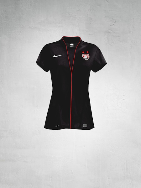
The Nike press release says, "The kit is designed specifically for the female athlete, to enhance the range of motion and create a uniquely feminine silhouette." But for anyone fearing that the nurse look isn't intimidating enough for a side aiming to win the World Cup for the first time in 12 years, the black away kit (which has the same design) is "inspired by the beautiful but deadly Black Widow spider." So, deadly Black Widow nurse spiders. Got it.
Whatever it looks like, it certainly didn't hurt their performance as they beat North Korea 2-0 -- the largest margin of victory so far in the tournament.
Here are a couple of pictures of the two shirts on their own...


No comments:
Post a Comment